Thought I would share with you quickly, how the final cover draft for The Price of a Sword came about.
Okay. So first things first. The Price of a Sword is an Historical, so this in itself was going to limit stock possibilities. You would really think that some forward thinking photographer out there would realise the need for attractive models in period dress. Considering that the publishing industry is a big time user of stock sites. But that is a whole other post and I digress ..
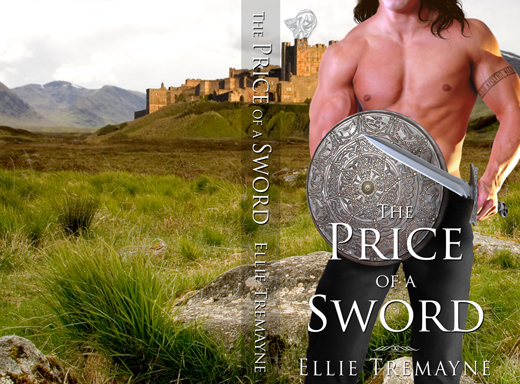
It was decided that we’d just go with the Hero on the cover, so after trawling through the stock sites, I managed to pull the following together. The sword isn’t in his hand at this stage, but I’m sure you get the idea 😉 Oh, and I’ve also added some perspective to the targe (shield). Now, for some strange reason I thought that this book was the second in a series. So I originally set the cover up like Prince of the Three Mountains where the Hero was chopped off at the waist by the title banner. Claire quickly set me straight and suggested that perhaps we could use the Hero’s full torso in this one.

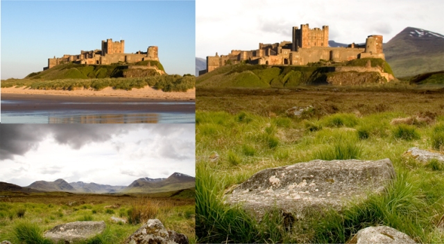
Now that I have the Hero partially together, I moved on to the background. The story is set in a Castle on the moors. So with a bit of cutting, pasting & blending .. ta-da .. and we have a castle on the moors. Sometimes I might match the colour of the objects so they blend better but I don’t think I did that here. I quite liked the glow that the castle had to it and the lighting on the model seemed to mirror that ‘sunlight’ effect.
Next I’ll place the images together to get a feel for placement, lighting and suitability. If I’m happy I will continue by adding more detail to the images. The Hero had some Greek blood, hence the dark hair and Greek writing in his tattoo arm band. I’ve also added the sword by this stage. There was some additional lighting on the model’s right shoulder/arm that I didn’t want, so I’ve painted that out. I’ll usually then finish off by touching up shadows and highlights.

Then it’s on to the Titles. This is probably where I have the hardest time of it. Deciding where to place the text without detracting from the cover. Sizing, fonts and colours are possibly where I fall down the most. I’ve only just recently started working on the full cover spread in one document. I used to have one file for the cover, one for the spine and one for the back. While it’s taken some getting used to the full spread is probably the easiest to manage. Plus there’s less files to have to send to Claire 😉 Which I’m sure she is happy about 😀
So here we have it. The final full cover spread with titles. 😀


That was so interesting. I wondered how Cover artists came up with this stuff.It’s an artform in itself. It looks damn good. Well done…oh, but wait, you’re an Aussie…of course it’s going to be good.
‘ken oath, maaaayte! LOL. Yeah, you’d be surprised the lengths we cover artists go to, to pull a cover together 😉 Glad you found this little insight interesting.